

The seven most annoying SaaS pricing and packaging tactics
The seven most annoying SaaS pricing and packaging tactics
...that almost every SaaS company uses

I’ve been deep into data collection these past few weeks. Maybe too deep - can anybody recommend good blue light filtering glasses?
We are furiously building out XaaS Pricing data on an interesting cohort of companies for a new collaboration (to be announced soon). In the past few weeks, we’ve combed 100s of pricing pages from a diverse set of high-growth SaaS players.
After a certain amount of data digging, patterns start to form.
Today I want to focus on the not-so-good patterns. Not exactly the Valentine’s Day spirit, but alas, no time like the present.
Some of these practices are the result of overall pricing strategy architecture, while some are fallacies of pricing page design.
Some tactics can be explained away as “industry norms” (everyone doing the same things everyone else is doing versus focusing on customers, being unique, and taking risks). Some are attributable to the nuances of products and buyers in a given market (developers want to see the granular details on features!).
There’s some strength in numbers here - almost every SaaS vendor does some version of at least one of these.
So is a vendor an outcast for committing one of these fouls? No. They are like everybody else.
But where’s the fun in being like everyone else? Clarity, transparency, and simplicity win in pricing, particularly when you’re stacked up against competitors (yes you all have them) are are trying to articulate a unique value position.
So roll against the tide, march to the beat of your own drum, and watch out for the following as you’re designing or re-designing your pricing page:
Providing a bunch of add-ons, but not tying them to a solution
It’s great to offer add-ons. Vendors should do it more. Add-ons are a key pathway to monetization and upsell, and can be executed on without diverting attention from a core product. But pricing pages rarely articulate why you’d want or need those add-ons or how they fit into a comprehensive solution for a JBTD. Sometimes an add-on is really just a feature everyone needs, too. Vendors could do better to message why packages of features are needed and who and what they serve, even if monetized separately.
Hiding overage charges or other costs in Q&A resources or feature tables
This one is rampant. This is the one where the price is listed as “$20 per user, per month” in the summary at the top of the page, but as you dig into the features and comments, you see 10 overage charges and another five conditions on that $20 per user pricing. Often the core monetization levers are those described in the Q&A, not what’s presented as the price on the page.
Burying conditions on consumption in Q&A resources
Many pages will provide details on usage caps - for example, “for the Business tier you get up to 50 GB cloud storage, per month. What’s often buried are the conditions on that usage. Companies often have “use it or lose it” policies where unused consumption does not roll over. These are flat-fee subscription models masquerading as usage-based pay-as-you-go models.
Burying conditions on users in Q&A resources
This is like the above, but for users. This can often look like stringent conditions on how users are treated or counted. Sometimes a “user” isn’t really a user, it’s all the employees at an organization. Other times this might look like a condition where any add-on must be added on for all users, or all users within an account must upgrade to the next plan at the same time.
Playing fast and loose with feature charts
This often happens with add-ons. Pages will use a panoply of different icons to present features as part of a particular plan, when those features are really just paid add-ons that are available to customers that are using that plan. At other times, the masthead summary description of a plan will list a feature as a key element of the plan, but detailed features will indicate that the feature is 'available to” customers of that plan. This happens a lot with higher-end plans providing SSO. It’s not that something like SSO shouldn’t be an extra fee - it’s about how the copy messages the costing of the feature.
Defining price and usage metrics too softly
Take the example above - sometimes language like “members” is used, when in reality, the pricing metric is “employees” or another more all-encompassing definition. This approach is rampant across the burgeoning ecosystem of companies in the “modern data stack” space. Many have crafted their own pricing metrics, and they are often opaque in definition - “a [insert made up computational unit here] is a normalized unit of compute and storage…”.
Burying minimum and maximum usage conditions
This is usually tucked in an asterisk or described with vague copy somewhere on the page, typically in the Q&A section. It often applies to plans with cutoffs on minimum or maximum users. Take a look at Zoom’s pricing page, for example - there are minimum user counts for each plan, but they are tucked in small font and then buried down in the feature comparisons.
If you’re reading this far, you probably agree with at least a few of these.
So what can be done better?
Most simply - focus on features and functions at your own peril.
Focus on the Job To Be Done (JTBD), and design pricing to capture value associated with the pain points of that JTBD, and succeed.
There’s a school of thought out there that the best companies design the product around the price (see Monetizing Innovation). There’s a case to be made that these tenets would help transform complex and confusing SaaS pricing models, and also, help simplify and optimize SaaS pricing pages.
That’s easier said than done, and many of the practices above aren’t easily replaceable. Pricing can be complex and difficult to present simply.
A case study in reduced annoyance
In the course of my pricing page travels, one company we reviewed was Wistia. Wistia grapples with some of the same challenges as others - overage charges, multiple pricing meters, tiered conditions, etc. But they have developed some unique ways of articulating pricing, which I think other players may benefit from throwing in their swipe file for their next page redesign.
The Wistia page focuses on the outcome, and doesn’t merely present a (granular and confusing) set of different prices and features. Their page presents a pricing narrative as part of a product and consumption narrative.
For starters, they are upfront and clear about their overage / usage pricing - “Add as many video or audio files as you need for 25¢ per month”.
But what I really like is how their Q&A addresses overage charges for bandwidth and storage (see below). A lot of other pages would bury this answer under a drop-down, and then would simply say something like “bandwidth overage is charged at a rate of $X per GB-hour, and storage at $X for 100 GB, $Y for 500 GB”.
Wistia takes it one step further and helps the user contextually understand the potential for overage as part of a solution TCO. There are bandwidth and storage overage charges, yes, but it only applies for 1% of customers, so the average customer probably should just be aware of it but not worry about it.

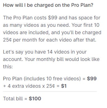
Wistia also provides a really simply calculation example to show how it’s pricing works:
What could be next?
PLG forces companies to become more mature and sophisticated in tracking, analyzing, and managing customer usage.
As companies gather more data on customer usage behaviors, and become more mature in how they act upon that data to make strategy decisions, more opportunities will arise to redesign pricing around typical usage scenarios.
One avenue is pure usage-based pricing, versus the usage-defined subscriptions and hybrid flat-fee or per user + usage / overage models that dominate today.
Another is redesigning existing models around customer pathways and solution journeys.
So instead of simply picking a tier, selecting some add-ons, and planning for usage (usually with the consultation of a sales team), a customer could choose a set of criteria - “I’m a business of this size, with these needs, and these characteristics” - and be self-guided to a composed solution that makes sense for them based on how other businesses like them get value from the solution.
One company that is on the right track with this is HPE with their GreenLake offering. Their offering is definitely IT-centric and complex for the business buyer or user. Their configurator distills this by taking the customer through a series of questions that are workload and outcome-focused to help steer toward a set of preconfigured solution modules that draw upon different GreenLake SKUs.
Whichever way the cookie crumbles with how these models get deployed in SaaS, we’ll be watching and gathering the data, to help vendors like you learn from peers at scale and make better pricing strategy decisions.
Have a good week!
-Bryan